Image Map
Showing posts with label holo. Show all posts

July 21, 2014

Enchanted Polish - May 2014, June 2014 and July 2014 Swatches & Reviews

Heeeyoooo.

I was in my first online semi-argument with a delightful gal in a CVS couponing Facebook group in which she suggested I stick coupon tearpads up my hindquarters and find a male chicken to entertain myself with (note: paraphrased for the younger readers). The thread was sadly deleted, but it all started when another member of the group called a fellow out for selling coupon tearpads which he very unlikely procured legally. Some members were saying there's nothing that can be done about it and that our having a discussion about it was a waste of time. Long story short, my whole thing was that regardless of HOW wrong what he's doing is, it's still wrong. Then we had the whole "there are murders happening and you're worried about THIS?" comments. I just... I guess I'm lucky to have been raised with a conscience and a clear outline of the difference between right and wrong. I'm not saying that coupon fraud is on the same level as murder, but it's still a crime, you know? Shoplifting something for $2 isn't a major offense, but it's still punishable by law, dawgs. 

I mean seriously. Hrrgrgg. The worrrrsssst are comments that are like "you're stupid for spending time arguing about it blah blah blah". Like, what are you LITERALLY doing right now? I just can't even.

So anyway, Enchanted Polish Monthly Mysteries versions May, June and July; editions 2014: I'm slightly underwhelmed.

Enchanted Polish May 2014 June 2014 July 2014 Swatch


May is this pumpkin orange jelly with some linear holo and that sparkle I always talk about that EP has, except in pink. It has a lot more dimension on the nail than my photos show; it almost looks like a glass fleck buuut not. This one had the best formula -- two easy coats and required zero cleanup. I like this one the best out of the three which kind of indicates my underwhelm-ed-ness since I'm pretty "meh" about orange in general.

Shown below is two coats without topcoat.

Enchanted Polish May 2014 Swatch
Sunlight

Enchanted Polish May 2014 Swatch
Sunlight

Enchanted Polish May 2014 Swatch
Shade

June is a plum-my purple/berry pink metallic duochrome with linear holo and that pink sparkle action. It reminds me of all those purple-toned multichromes except instead of going all the way to gold, this one stops at pink. The formula wasn't as smoothy-smooth as May but it was still pleasant.

Shown below is two coats without topcoat.

Enchanted Polish June 2014 Swatch
Sunlight

Enchanted Polish June 2014 Swatch
Sunlight

Enchanted Polish June 2014 Swatch
Shade

Enchanted Polish June 2014 Swatch
Shade

Enchanted Polish June 2014 Swatch
Shade
While this one is the most interesting in terms of what's going on in a nail polish, I'm not in love with it like I think a lot of people are. Some people, maybe. A few. I don't know if it's the shade of purple or what, but I was just kind of like, okay, neat. *shrug*


July 2014 is a metallic bright cherry red with linear holo and pink and blue sparkle which very barely shows up on the nail. Pretty basic and uninspired-feeling, which bums me right out since July is my birth month and I was hoping for something blam-tastic. I don't, like, LOVE rubies or anything, but I kind of wish this was a jelly instead of being metallic to emulate July's birthstone more. Deep cherry jelly with red shimmer and linear holo... that's a monthly I would campaign for, yo. I don't hate this polish, but I don't see myself reaching for it anytime soon. The formula on this guy was also pretty suck -- quite goopy compared to what I've become used to with EP formulas. Sigh for days.

Shown below is two coats without topcoat.

Enchanted Polish July 2014 Swatch
Sunlight

Enchanted Polish July 2014 Swatch
Sunlight

Enchanted Polish July 2014 Swatch
Shade

The shade picture definitely makes it look a lot more interesting than it actually is, just FYI. If it looked like that IRL I would be all about it.

Aaaanyway, that's that. Five more months of this mystery stuff and I kind of think I might be done with Enchanted Polish. Unless something in the next five months blows me right the heck away, I'd rather spend my dolla-dollas on polishes that I know I'll love.


May 21, 2014

Catrice - Dirty Berry

Hey!

I am 1.) tired and 2.) nauseous. Like, soooooooooooooo tired. So tired.

Today I have a have an infamous little friend named Dirty Berry by the German brand Catrice, which I happily received in a swap.

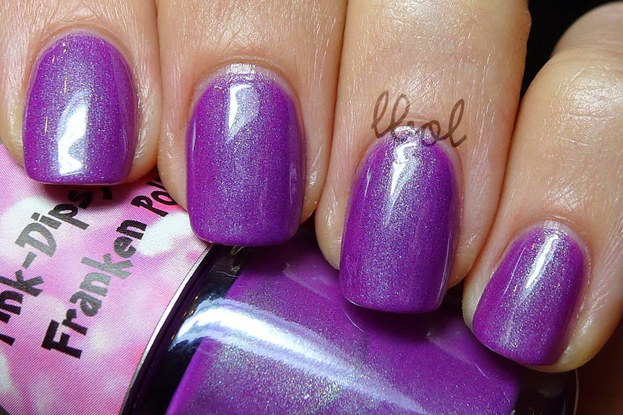
Dirty Berry is a dusty medium purple with scattered holo that, due to the misfortune of partially cloudy skies, is pretty much invisible in the pictures. Regardless, it's a pleasant color that's quite shiny without topcoat. The formula was a bit runny (despite the Catrice website going on about perfect coverage in one coat and all of that... no way, man) but I'm not even mad about it. Runny, shmunny. This polish isn't available in the ol' States, plus it's discontinued, so I don't know what to tell you.

Worst. Blogger. Ever.

Swatches show three coats without topcoat under indirect sunlight, OKAY??


Catrice Dirty Berry Swatch


Catrice Dirty Berry Swatch


Ah, so... yeah. Dirty Berry.
I should be receiving some pretty awesome polishes in the mail over the next couple of days so hopefully my blog will be able to climb out of the rut of suck.

Hey, how about Mountain Dew Baja Blast being sold outside of Taco Bell now? I'm pretty okay with it! You know what I'm not okay with? Taco Bell discontinuing the cheesy bean and rice burrito. Holy shmow, I just got THE STRONGEST CRAVING for one of those. It's been, like, three years almost since they did, but I can still taste it. I don't typically advocate fast food, but every so often my body requires it. Gross and awesome.

omg all I want in this entire world is a cheesy bean and rice burrito. OOH OR MAYBE CHIPOTLE.

May 19, 2014

Polishnv - Fire In The Sky, Tilt A-Whirl, Route 66 and Mermaid Tears Swatches & Reviews


Hi guys! HEY!! Do you see that little picture up there? The one that says "Press Sample"??!! THIS IS MY VERY FIRST PRESS SAMPLE AND I AM SO PUMPED. Alsooo I changed my watermark finally. Now people won't be left wondering what the F an "lbol" is. I kind of finally feel like a real blogger!!


Polishnv Swatches

Today I have four (very soon to be released) colors from Polishnv. Purchasing info can be found at the bottom... after all the pictures and reviews and stuff. So let's dig right in, shall we?

The formulas with Fire In The Sky and Mermaid Tears were similar; three thin coats for opacity. I also used three coats with Tilt A-Whirl but you could likely get away with two. Route 66 only required two coats for opacity. They all applied smoothly and were neither too thin or thick. All of the swatches are shown with topcoat, with the first two pictures of each polish being taken in the sun while the last one shows it in the shade. Did you get all that?


Up first is Fire In The Sky, a purple/pink/red to rusty orange metallic duochrome with linear holo. Not a color I would ordinarily have chosen to wear, I quite like what it looks like on. It is a bit of a chameleon, shifting to varying shades of red/orange at different angles and lighting. The righteousness of the duochrome, however, is also most apparent out of direct light.

Polishnv - Fire In The Sky Swatch

Polishnv - Fire In The Sky Swatch

Polishnv - Fire In The Sky Swatch


Tilt A-Whirl is a summery bright light purple that has the most subtle linear holo of the bunch. I love this kind of purple -- I swatched it last so I could wear it around for a bit! It takes on a softer berry tone in the shade but really pops in the sun.

Polishnv - Tilt A-Whirl Swatch

Polishnv - Tilt A-Whirl Swatch

Polishnv - Tilt A-Whirl Swatch


Route 66 looks, in the bottle, like a vampy burgundy red with subtle linear holo but applies lighter and takes on a raspberry quality in the sun. I thought this color was going to be a bit too dark for Summer but it's totes nots. I'm looking at the bottle indoors, right now, and it seriously looks brick red. What a little trickster.

Polishnv - Route 66 Swatch

Polishnv - Route 66 Swatch

Polishnv - Route 66 Swatch


Finally we have Mermaid Tears, my (unsurprising) favorite of the bunch. Heavenly shade of blue? Check. Aqua flash? Check. Having to do with crying? Check! I would punch a mermaid in her throat if I knew her eye juice was this pretty. To, you know, make her cry so I could collect her tears... not just because I had the knowledge... anyway, it's real pretty is what I'm saying. It's also got kind of a scattered linear holo, if that makes any kind of sense. The arch is loose, but it's there.

Polishnv - Mermaid Tears Swatch

Polishnv - Mermaid Tears Swatch

Polishnv - Mermaid Tears Swatch


These little darlings will be available on the Polishnv Etsy Site (which can be found here!) soon and will be sold for $9 bucks a pop, full size style.

May 14, 2014

Colors by Llarowe - Paper Moon Swatch & Review

Hi guys.

I know this is probably going to break your hearts and for that I am deeply apologetic, but my blogging may become a bit more sporadic for a while, here. I found out a thing, and I need to find out other things concerning this thing before I can confidently go forward and blog.

I'll keep you posted, though. It's a good thing, by the way. :) See?

Today I have a bit of a lemming for your viewing pleasure: Paper Moon by Colors by Llarowe by. Unfortunately, she's discontinued as of, like, a week ago. Sorrrryyyyy.

Say it's only a hmm hmm hmmmmmm...

Paper Moon is a lilac insane-o linear holo. Like, you can almost hear this nail polish yelling excited obscenities in the sun. As per the us... how would you write out the awful, short form of "usual"? What makes that z+sh sound? Zh? Yoozh. Yewzh. Anyway, per the norm, the formula with this was bomb and dope and all of that. Budduh.

Shown below is two coats with topcoat. The first picture shows Paper Moon in direct sunlight, the second is indirect sunlight and the third is shade.

Colors by Llarowe Paper Moon Swatch
"HOLY SH*% I'M HOLOGRAPHIC"

Colors by Llarowe Paper Moon Swatch


Colors by Llarowe Paper Moon Swatch

Don't be too sad if you missed out on this; CbL is releasing 35 new shades on May 26th so you're sure to find something else to fill the void in your hearts. Your poor hearts are going through a lot these days, huh?

Oh, also, Llarowe describes a few of them as "strong linear holo" which I, uh, clearly hate.

April 29, 2014

Too Fancy Lacquer - Set Fire To The Rain Swatch & Review

Hi there.

Remember that tear I was telling you about in my middle finger nail? That I thought was holding tight with the teabag repair? Welp the other day I was at the grocery store, and I don't know exactly when it happened but my nail peaced right on out. Traitor. So it's back to nubs we go.

Fortunately, Set Fire To The Rain by Too Fancy Lacquer looks pretty great on nubs. In fact, this polish would look stellar even on, like, tree bark if that's what started growing out of my fingers. It's insanely pigmented and I had zero problems with staining (but I was also very careful not too flood my cuticles just in case), and the color is the most perfect shade of blue you've ever seen --cerulean-- which is MY FAVORITE COLOR!!! Cerulean blue for everybody!!!

Sir-oo-lee-in.

It's got that imbedded linear holo that doesn't just look like a rainbow is sitting on top of the base color. Blue rainbows. Not to mention that the formula was fantastic to boot.

I give everything such glowing reviews (except those Essies... shudder and weep), don't I? I need to be more critical. I dunno, I think I just luck out with my polish purchases. I just really like this polish, okay guys? Ceruuuuleaaan.

Shown below is two coats with topcoat in direct sunlight (which I'll be using more now that it's warming up FINALLY. I love my OttLite and all, but nothing beats the blang-inducing power of the sun).

Too Fancy Lacquer - Set Fire To The Rain Swatch


Too Fancy Lacquer - Set Fire To The Rain Swatch

I feel like there's kind of a richness I'm lacking with my pictures. Plus the color is like, the tiniest bit warmer and more saturated in real life. In real life, as opposed to in the fake life of the internet.

Anyway, whatever to my glowing reviews. This polish rules.

I really suck at closing statements. I wish I could skip this part sometimes. Like, weeeell... those are my pictures. Okay, bye!

April 21, 2014

WingDust Collection - Steel Town Girl Swatch & Review

How was your holiday, if you celebrate Easter? Otherwise, how was your Sunday?

I drank a bunch of wine at my boyfriend's grandma's house with his mom's side of the family for brunch. Not only wine for brunch -- Andy's grandma happens to be one heck of a chef. Then we went to my dad and stepmom's house for more delicious food, and then we came home and unsuccessfully tried harvesting Blaze Rods in the effing Nether. I swear that's not innuendo.

I've heard nothing but great things about WingDust Collections, and I've had on my eye on Steel Town Girl for quite a while now so when I saw it restocked at Llarowe I had to get it. Duh.

Steel Town Girl combines pretty much everything I love in a nail polish: the color blue, holographic whatnot, gold leaf, and THE WOW FACTOR. No but seriously, this polish is like the big bang happened inside of my hands and little flat strips of the result are squeezing out through the tips of my fingers.

Like little galaxies, y'all.

Steel Town Girl is a linear holographic deep steel blue base filled with metallic light blue, iridescent and holographic shards and 23k gold leaf flakes. The description sounds kind of over-compensatingly complicated but the actual product is baaaaaaaaaallin'. Plus the formula was super easy to work with, and even though WingDust disclaims that the flakes and shreds might be a little stubborn, I had no problems getting a nice amount on my nails.

Shown below is three coats with topcoat.

WingDust Collections - Steel Town Girl Swatch


WingDust Collections - Steel Town Girl Swatch


There's a lot of depth to this polish that usually takes multiple polishes to achieve. I also had zero issues with the shards or flakes trying to do sticky-up stuff anywhere, so that was a nice added bonus. I hate when shards are all pointy and think they can just do whatever they want.

April 18, 2014

PinkDipsyBulle - Hades and Rapunzel Swatches & Reviews

Easter's on Sunday and I haven't done any Easter manicures yet. Lame.
I also haven't gone Easter shopping for the kids yet which is kind of double lame. Procrastinationnnn!

Today I have two LE polishes from Pink Dipsy Bulle - Hades and Rapunzel.

Hades is a dark grey polish (that leans purple, like eggplant kind, in certain lights) with linear holo. The formula was smooth and leveling; no issues to report.

Shown below is three layers with topcoat. I've warmed up the tone of the second picture to show the eggplantiness of the polish. The third picture is taken in direct sunlight.

PinkDipsyBulle - Hades Swatch

PinkDipsyBulle - Hades Swatch

PinkDipsyBulle - Hades Swatch


Next up is Rapunzel, a purple/fuchsia with soft aqua shimmer. I had the tiniest bit of an issue with streak-times with the first two coats but by the third the polish looked evened out. I'm a huge fan of the color of this polish. Huge. So huge. So big.

Shown below is three coats with topcoat.

PinkDipsyBulle - Rapunzel Swatch

PinkDipsyBulle - Rapunzel Swatch


PinkDipsyBulle has a way with contrasting shimmers in her polishes. I love the simplicity of them. Most of the time all I want is just a nice pop of color, you know? But something more interesting than a plain creme. Bam! PDB to tha rescue.

Side note: I am so. Over. Stinkbugs. Seriously. I've had to put duct tape around my stupid fireplace to keep them out and they're still getting in, and my cat, bless him, can't catch them because he has the coordination of a door knob.

You can find these two lovelies here for six bones a pop (they're 10ml bottles, just so ya know) but they're quite limited so hurry the heck up if you want them. There are two other LE colors that I'm considering getting but they're a bit darker and we know what dark polishes do to my spindly witch fingers. They make them look even spindly-witchier, is what they do. Why don't you know that? Don't you read my blog? I mentioned that, like, eight posts ago or something. Geez. Oh also they're Fairy Tale themed, because they weren't already the pinnacle of cute.

April 17, 2014

Colors by Llarowe - Oops! Bag (round two) + Teal Oops Comparison

Hi everybody! Hi new friends! I just want to take a couple seconds here to thank you guys for reading and following. Without sounding like too much of a giant poop, I don't often feel very accomplished. I'm a stay at home mom (who majored, but didn't earn a degree, in printmaking) and it's difficult for me sometimes to find, like, merit in my life. I know "being a mom is the hardest job in the world" blah blah blah. It has its ups and downs, but the thing I struggle with the most in being a SAHM is that there isn't any sort of universal scale I can use to see if I'm doing a good job, you know? The kids are alive and fed and clothed most of the time, so I'm at least getting passing review. Oh, and loved. Can't forget about that love thing.

Aaaaanyway, that all is to say that it's really awesome to be able to look at my blog stats and see an increase in readership, more comments, things like that. You guys rooting me on. I know it's just one silly nail blog in a sea of thousands of (mostly better) nail blogs, but the support is thrilling. I mean it.

[insert cute 'thank you' GIF here]

Colors by Llarowe had another restock on Oops! Bags so obviously I had to get one. Super pumped to have only received one duplicate (Oopscat, actually, which I'm pretty all right with!) out of the three polishes that are included in the Oops! Bag.

The two new ones I received are:

1. Pink Sprinkles Oops!
This guy was the result of bleeding glitter but actually turned out to be a favorite amongst customers. The base shade of pink is so freaking pretty (and flattering on my skin tone) and the addition of the magenta glitters brings a nice little addition to an already great polish. I've only seen one swatch of OG Pink Sprinkles and I like the Oops! waaaay better.


2. Teal Oops!
I saw a bottle shot of this color after the last Oops! Bag restock and wanted it desperately as I am a TTW (total teal whore, which I just made up, which I am totally going to implement henceforth).


... remind you of anything? Liiiike, maybe a certain Literary Lacquer called Pan Galactic Gargle Blaster? I compared the two, if you wanted to see:


Yeah, they're pretty much identical. The only real difference I noticed was that Pan Galactic Gargle Blaster has the edition of holo micro glitter. Whaddya think about THAT?

I mean, I looooooove P.G.G.B. so whatever whatevs. It was just kind of like 'oh, hey...'. The formula's great on both of them so no complaints.

April 14, 2014

Sinful Colors - Hot Chilli Swatch & Review

I was pretending to go to sleep on this pile of blankets with my almost 2-year-old which is by the couch with a surround sound speaker on a stand next to it. Little rambunctious boy does some kind of Tasmanian devil/ninja move and knocks the speaker over onto my face. I caught the edge of it with my forehead so now I've got this enormous goose egg and this is one of those rare moments I'm actually thankful for cutting my bangs. At least I was the one who got smashed, if we're going to look on the bright side like sensible people.

Today I have kind of a bizarre polish to share with you. It's called Hot Chilli and it was part of the Sinful Colors Spice It Up! collection out last Fall. I never ended up seeing the collection for sale anywhere so when I saw Hot Chilli for sale on Storenvy I figured I may as well get it.

It's got a silver cap, which for Sinful Colors means the polish is textured or part of the Diamond Lust collection, neither of which it is (though please correct me if I'm wrong here; I only did a little research here and by research I mean I Googled "Sinful Colors silver cap" and those were the only two things that came up).

Hot Chilli is sort of this metallic red base with small and micro holo glitters hanging out in there. It's a little on the thick side, but it wasn't frustrating to work with.

Shown below is two coats with topcoat.


I'm so kind of 'eh' about this polish. I don't hate it because it's kind of nice to look at, but there's just something about it that I don't love. I don't really know how to describe it. Or maybe this is just the self-diagnosed concussion talking. I don't know, guys. I probably won't ever wear it again but I'm going to hand on to it because I'm intrigued by the whole silver cap thing.

The siiiilver caaaap.

Any ideas as to why it's silver?

April 11, 2014

Enchanted Polish - March 2014 and April 2014 Swatches & Reviews

Do you ever start updating your blog and notice that what you're writing is boring and lame and delete it?

We're up to month 4 now with the Enchanted Polish mystery pre-sales and the colors keep getting better, though the three polishes she released for that Mishka collab thing (which I find completely bizarre by the way and I'm a weirdo) are goooorgeous. I would assume that's why March and April were pre-sold together.

N
  E
    Wayz...

March 2014 is a happy apple green with yellow highlights, that signature light blue microglitter, and completely in. ya. face. linear holo. I had a sneaking suspicion that March would be a green polish (for St. Patrick's day, you know, since February was pink like Valentine's Day and January was dark teal for... uh... seasonal depression) and it's a really good green. It works really well with my skin tone I think and it's not just boring crayon green so I'm pleased. Brandy is pleased. Also the formula is thick in a pleasant and workable way and self-leveling.

Shown below is two coats with topcoat in BEAUTIFUL OHIO SUNLIGHT CUZ IT'S LIKE 68 DEGREES OUT, BISHES.


April 2014 is a soft blue-grey with white highlights (can that even be a thing? I want to say they're like really really really pale pink but I could seriously be crazy) and subtle linear holo. It's a sweet, feminine color. Blue for Autism Awareness Month? I'm glad it's not your typical spring pastel which I absolutely haaaaaaaate. I'm one of those people. Same formula as March 2014 (or, as usual really for EP).

Shown below is three coats with topcoat.


 April 2014 has reeeeally grown on me. I love how it kind of looks grey in some light and I superlove how it looks on my nails. I'm still pretty excited to see what future months will bring. I was thinking about this whole thing and how long she's going to do the monthly pre-sale. Is it just going to be this year? Will she go back to regular releases afterwards? I wonder when she'll stop making polish.

Deep thoughts.

Anyway, we're going to the park because, like I said, it's awesome out. It's supposed to snow next week. OHIOOOOOO. Better enjoy the warmth while I can.